Roger Excoffon

1951

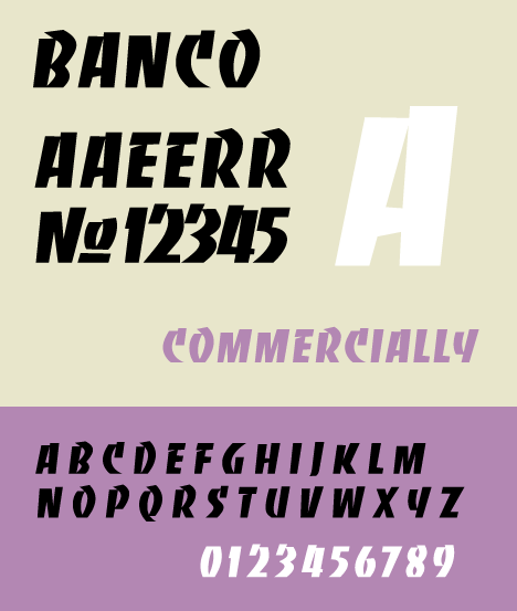
BANCO

exemplo de Banco

HISTORY

ORIGIN

Like Excoffon's later fonts Mistral and Choc, Banco was designed to be eye-catching, with what designer Cyrus Highsmith called an "outspoken flair."

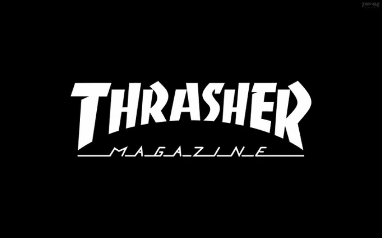
The font was considered old-fashioned and unappealing by designers of the time, and after launch it was primarily used by small businesses in Europe. The font's popularity was renewed when it appeared on the cover of Bob Marley's 1974 album Natty Dread, and subsequently on many other reggae records. The skateboarding magazine Thrasher, which was heavily influenced by reggae and dub culture, adopted it for its 1981 launch and later issues.It was used on the PK Ripper BMX, the tv series Darkwing Duck or the video game Shinobi Legions.

While Excoffon did not design a lowercase alphabet for Banco, Phill Grimshaw and the ITC font foundry released a lighter-weight version of the font in 2000, which included lowercase letters.Banco was also translated into Cyrillic in 2000.
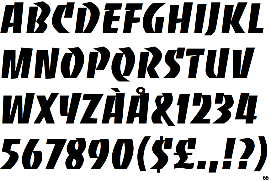
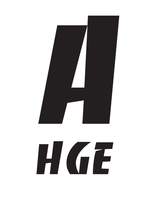
Banco font

VOX-ATYPI

CALIGRAPHIC

GRAPHIC

The most general class in this classification system, these font types are designed for display.

voxatype
roger Excoffon

Roger Excoffon

Excoffon was born in Marseille, studied law at the University of Aix-en-Provence, and then moved to Paris to apprentice in a print shop. In 1947, he formed his own advertising agency and concurrently became design director of a small foundry in Marseille called Fonderie Olive. Later, he co-founded the prestigious Studio U+O, named in reference to "Urbi et Orbi".Colleagues described him as a man of exceptional charm, whose personality was directly reflected in his “lively” and dynamic typefaces.His character was impulsive and quick. He spoke energetically, accompanying his speech with active gestures. Speed ​​was his life's credo: he strove to instantly grasp the essence of things and derive pleasure from them.

banco typeface